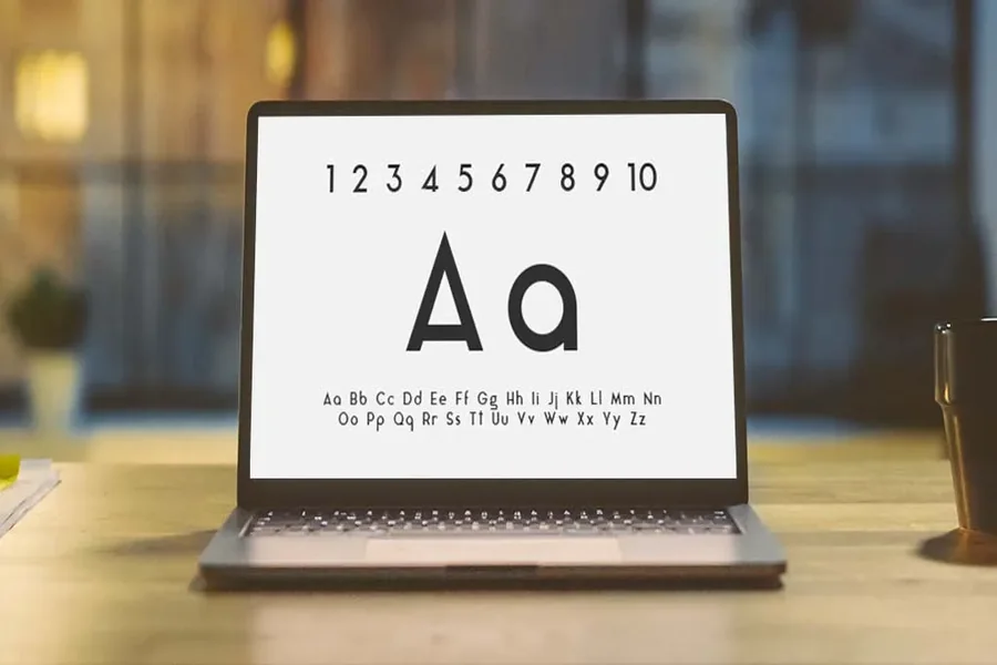
In the ever-evolving world of design, versatility is key—and nothing exemplifies this better than sans serif fonts. Known for their clean lines, legibility, and modern appeal, sans serif typefaces have become an essential part of every designer’s toolkit. From user interfaces to printed editorial layouts, sans serif fonts seamlessly adapt to a wide range of creative projects. In this article, we explore why these fonts are indispensable and highlight some of the most versatile options you can rely on.
Why Versatility Matters
In today’s design landscape, creatives often work across multiple mediums—from web and mobile apps to printed brochures and packaging. A versatile font ensures consistency in visual language across all platforms. Sans serif fonts shine in this area because they scale well, remain legible in small sizes, and maintain visual harmony whether on screen or paper.
Fonts like TT Norms® Pro and TT Interphases Pro, for example, offer wide style ranges and extensive language support, making them especially valuable for global branding and digital interfaces. These fonts are not just attractive; they are engineered for performance, usability, and cross-platform consistency.
TT Norms® Pro – The Geometric Champion
One of the most popular and widely used sans serif fonts today is TT Norms® Pro. This geometric typeface includes an extensive range of 104 font styles, providing designers with flexibility in weight, width, and tone. TT Norms® Pro works beautifully in both UI environments and printed materials, offering clean geometry and excellent readability.
Its balanced design makes it suitable for everything from corporate branding and signage to editorial layouts and mobile apps. The typeface also includes advanced OpenType features, making it a powerful tool for typographic control.
TT Interphases Pro – Built for Interfaces
TT Interphases Pro is specifically designed for digital applications and excels in user interfaces. With 43 font styles, this family is built with screen legibility in mind. It maintains clarity in small sizes and high-resolution displays alike, making it perfect for websites, mobile apps, and software platforms.
However, its utility doesn’t end in the digital world. TT Interphases Pro’s clean and straightforward appearance also works well in print, especially for instructional materials, technical documentation, and educational content that demand precision and clarity.
TT Commons™ Pro – Modern and Neutral
If you’re looking for a neutral, highly functional typeface that fits almost any project, TT Commons™ Pro is an excellent choice. With 22 styles and a wide range of typographic features, it provides designers with the tools to create clean, modern layouts. Its versatility makes it a solid choice for both body text and headlines, whether in digital or printed formats.
This font’s aesthetic neutrality allows it to blend into a variety of brand identities without clashing with other design elements, making it a favorite among branding professionals and UI designers alike.
Conclusion
Choosing the right sans serif font can elevate your design by improving readability, reinforcing brand identity, and enhancing user experience. Fonts like TT Norms® Pro, TT Interphases Pro, and TT Commons™ Pro are not only beautiful but also designed to meet the high demands of modern design work.
Whether you’re building a sleek mobile interface, designing a magazine layout, or creating a brand identity, investing in high-quality sans serif fonts ensures your design is consistent, professional, and timeless. From UI to print, these versatile fonts are tools every creative professional should have in their collection.
